Closing the Gap between Commitment and Delivery with our new Feature Progress Tracking

When Agile emerged in the early 2000s, it was a much-needed answer to bloated, slow, waterfall-style project delivery. It brought something refreshing: collaboration over contracts, responding to change over following a plan, people over processes. The goal was straightforward — deliver value faster, better, and together.
But somewhere along the way, that spirit has been quietly diluted. And the culprit, ironically, is the very pressure to deliver faster.
Agile was designed for adaptability, quality, and value, not raw speed. Effective Agile teams can absolutely deliver faster, but that's a consequence of doing it well, not the objective. When speed becomes an obsession, organisations tend to slide from Being Agile, into Doing Agile, which is a set of rituals that look right on paper. The result is teams going through the motions: burnout on one end, lower quality on the other.
The Commitment Problem Nobody Talks About
Here's a scenario that will feel familiar to most.
PI Planning ends. The Program Board looks ambitious but reasonable. Teams have estimated their loads, flagged their dependencies, and the collective mood is cautiously optimistic. Two sprints in, the cracks appear. Scope has crept in. A contractor's engagement ended earlier than expected. One team is visibly carrying work from the last sprint on top of new commitments. And somewhere in the background, a stakeholder is asking: "Are we still on track for the March milestone?"
The honest answer is: you don't know yet. You'd need to pull Jira data, cross-reference it with sprint plans, factor in what was added after planning, and manually track what's been delivered against what was committed. By the time you've assembled that picture, it's changed.
This is the gap. Not between Agile values and the real world, but between the commitments teams make and the visibility that exists to honour them.
Why Delivery Gaps Happen (And Why Blame Is the Wrong Response)
When a team under-delivers at the end of a PI or quarterly planning, the instinct is to look for an explanation in execution. They didn't work hard enough. They estimated poorly. They got distracted.
Sometimes that's true. But just as often, the problem started much earlier in planning. Features got added after PI Planning with no capacity to absorb them. Story points were committed against theoretical capacity rather than real availability. Dependencies were flagged but nobody tracked whether they resolved.
There's a meaningful difference between a planning gap and a delivery gap, and it matters enormously for how you respond. If a team consistently commits to 90 points and delivers 70, that's an execution conversation. But if they committed to 90, then 25 points of unplanned work landed in their lap mid-PI, and they still delivered 70, that's a different conversation entirely.
Most organisations can't answer this question with any confidence. Not because they lack the data, but because that data lives in too many places like spreadsheets, Jira boards, calendar invites, memory and nobody has synthesised it in a way that's visible at the right moment.
The Visibility Debt Accumulating in Scaled Agile
This visibility problem compounds at scale. A single Scrum team operating in isolation can usually hold enough context in their heads. But an ART with eight teams, multiple dependencies, a portfolio of features, and a PI Planning cycle every 10 weeks? The cognitive load is enormous — and the cost of a wrong assumption is equally large.
Release Train Engineers spend significant time as information aggregators. Collecting availability. Estimating real capacity. Tracking what was committed versus what shipped. Preparing data for Inspect & Adapt. These aren't inherently bad activities, but when they consume hours every sprint, they're crowding out the work that actually matters: coaching, unblocking, facilitating.
The question worth asking isn't "why don't we have better visibility?" — it's "why does achieving visibility require so much manual effort in 20265?"
From Scattered to Visible Data
The answer, increasingly, is that it shouldn't.
Modern scaled agile execution needs a layer that sits above individual team boards and below leadership dashboards. A space where capacity, commitment, and delivery are visible together, updated in real time, and explained in plain language rather than encoded in raw numbers.
That layer needs to answer a few specific questions:
- Before planning: What can we actually take on this PI, given real availability?
- During planning: Are any teams being over-committed right now?
- Mid-PI: Where is scope changing, and is it being absorbed or accumulating as risk?
- End of sprint: Of what was committed, what was delivered? And what carried over?
- After PI (Inspect & Adapt): Was the gap a planning problem or a delivery problem?
These aren't fancy questions. They're the foundational questions of responsible scaled delivery. But for most teams, getting a clean answer to even one of them requires significant manual effort.
How Kendis Addresses This with Collection Capacity and Feature Progress
This is where we want to be direct about what we've built — and why we think it moves the needle on the problem above.
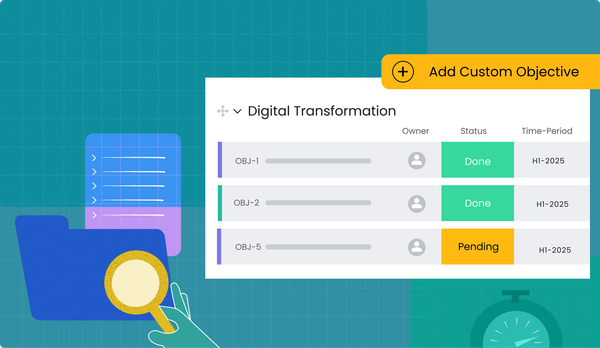
Kendis has always been built around the idea that scaled agile should be visible and manageable, not just documented and reported. Our latest investment in this direction is Collection Capacity and Feature Progress — a delivery intelligence layer built directly into your ART, Portfolio, and Department Collections.
Collection Capacity addresses the planning side. It shows you real available capacity rather than theoretical maximum, but actual capacity after holidays, PTO, ceremony time, and reservations have been deducted. It visualises this through a Capacity Lifecycle Waterfall that shows exactly how capacity flows from baseline to available to committed to delivered. When a stakeholder asks why teams can't take on more, you point at the waterfall. The answer is self-evident.
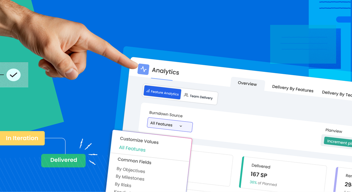
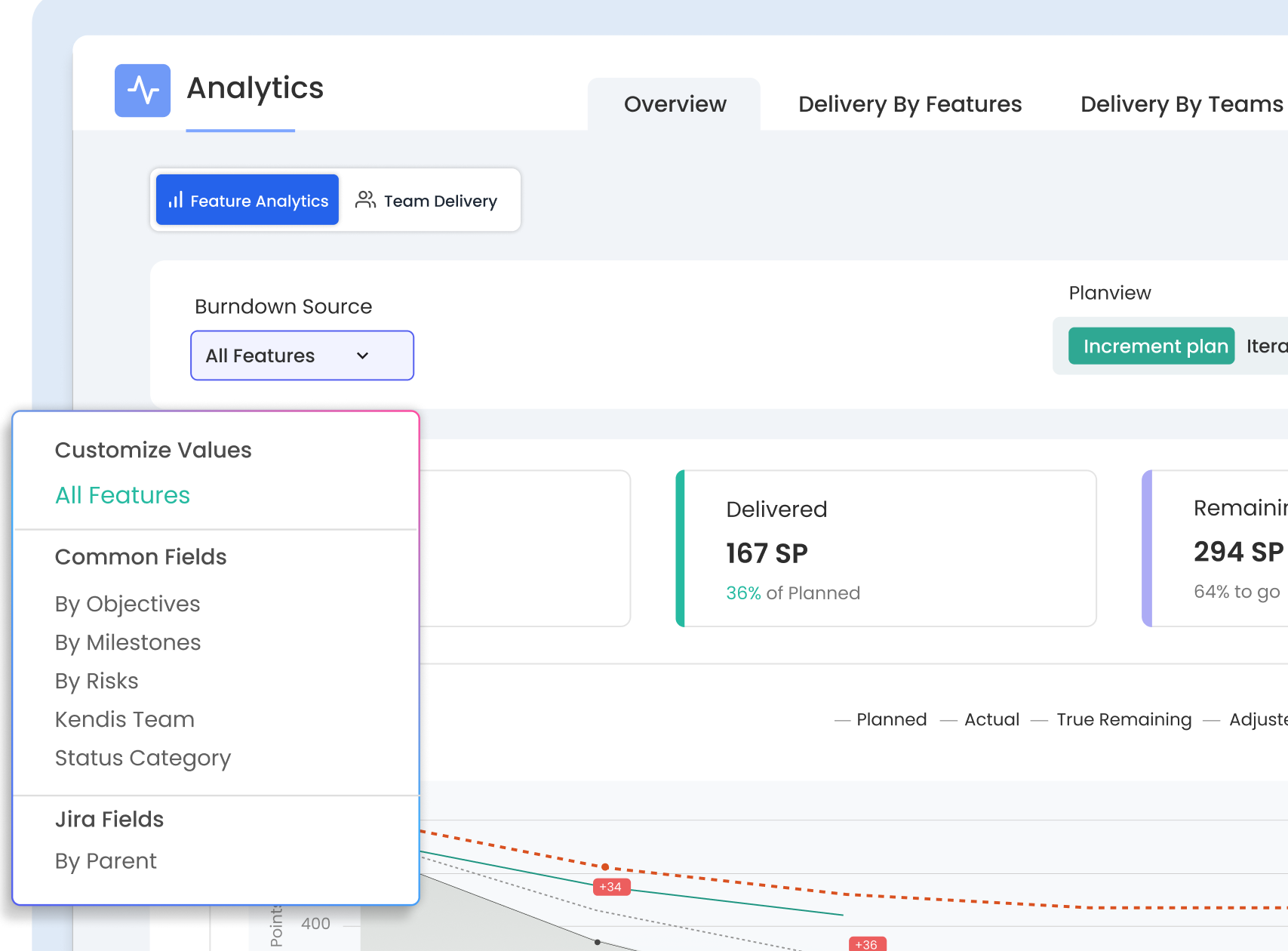
The Team × Sprint Capacity grid goes further, showing commitment ratios across every team and sprint, colour-coded for health, with the ability to drill down to individual team members. Feature Progress on the other hand addresses the delivery side. It's a burndown tool but one built for the questions RTEs actually ask. You can filter the burndown by Objective, Milestone, Risk, WSJF score, or Parent Epic, meaning you can see exactly how a specific commitment is tracking rather than looking at a single aggregate line.
The three-baseline model is where Feature Progress earns its place in Inspect & Adapt ceremonies. Every metric is tracked against
- The PI Plan (what was committed at planning)
- The Sprint Committed (what teams pulled into sprints)
- And Delivered (what was completed and accepted).
The gap between PI Plan and Sprint Committed is where replanning happens. The gap between Sprint Committed and Delivered is where execution happens. By making both gaps visible, the data can finally answer "was it a planning problem or a delivery problem?" — without the defensive conversation that usually precedes that answer.
Two other features worth calling out: carry-over tracking surfaces stories that rolled from one sprint into the next (a key signal when a team feels busy but the burndown stalls), and unplanned work detection flags stories added after PI Planning.
Closing the Gap
Agile started as an antidote to rigidity. The irony is that many scaled agile programmes have become rigid in a new way; rigid in their inability to see clearly what's happening, to separate planning failures from delivery failures, to know in sprint 3 what sprint 6 is going to look like.
Closing the gap between commitment and delivery isn't about holding teams to tighter standards. It's about giving the people who lead trains and programmes the information they need to make good decisions early — before the gap becomes a miss, before the miss becomes a post-mortem.
Collection Capacity and Feature Progress are available now in all Kendis Collections. Navigate to any Collection and click Capacity or Feature Progress to get started.
If you're in the middle of PI Planning preparation, start with the five summary cards on the Capacity Overview tab. If you're mid-PI and trying to answer a steering committee question, the Feature Progress burndown filtered by Milestone will get you there in one click.
And if you'd like to walk through it with someone from the team, book a demo and we'll show you how it looks with your data.